
The best MongoDB visualization tool depends on whether you need native MongoDB connectivity, embedded analytics, or SQL-based querying. This guide compares MongoDB Charts, Knowi, Looker, Tableau, and Qlik so you can pick the right one for your team.
TL;DR
- MongoDB Charts is the easiest option if you are already on Atlas, but it has limited customization and no SQL support.
- Knowi is the only tool with native MongoDB connectivity (no SQL translation, no ETL), plus support for cross-source joins with SQL databases and APIs.
- Tableau and Looker require a MongoDB BI Connector (SQL layer) which adds latency and limits query flexibility.
- For embedded analytics or white-label dashboards inside your own product, Knowi and Qlik are the strongest options.
Table of Contents
Choosing The Best MongoDB Visualization, Reporting, and Analytics Tool
In today’s data-driven world, businesses are becoming increasingly reliant on accurate and efficient data analysis to drive decision making. As a result, selecting the optimal BI tool or data platform is a critical decision. MongoDB, a popular NoSQL database, is compatible with various BI tools and data platforms, but determining the best suited tool for your organization’s needs is not a trivial task. Continue reading for an in-depth comparison between some of the top MongoDB data visualization tools on the market.
In this article, we will compare 5 of the best BI tools / data platforms for analyzing MongoDB data:
To start, we will give a high level overview of each tool. We will then explore each one’s ease of use, pricing model, data integration flow, customization options, and functionality to help you make an informed decision. We will conclude with a summary on what each tool is best for. The best tool for you depends on your specific needs, budget, and technical skillset.
An Overview of the Best MongoDB Visualization Tools

MongoDB Charts
MongoDB Charts is a native data visualization tool integrated within MongoDB. It offers a way of natively visualizing MongoDB data, allowing you to create interactive charts and dashboards without needing to move your data using additional tools. Charts can be embedded directly into MongoDB applications or shared with others.
Pros:
- Already integrated with MongoDB data
- Drag and drop builder
Cons:
- Only supports MongoDB data
- Doesn’t easily support cross-collection joins
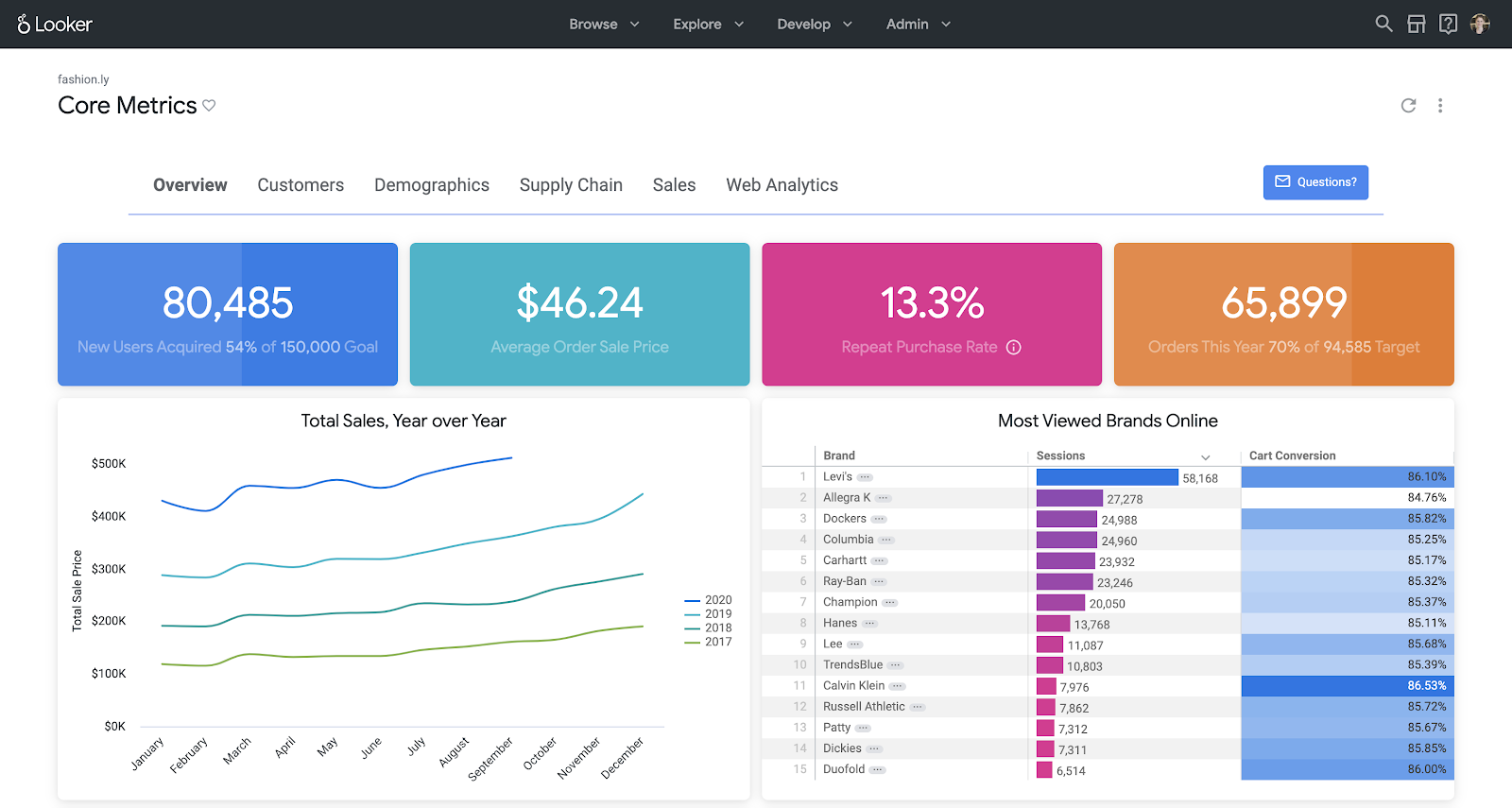
Looker
Looker is a data visualization tool acquired by Google in 2019. Looker can connect to BigQuery, Redshift, and many other SQL databases. It does require tools to ETL your data from your data store into the platform. Aside from dashboards and visualizations, Looker has many capabilities packed in including embedding, actions, and data modeling.
Pros:
- Lots of visualization options
- Supports git version control
Cons:
- Requires MongoDB connector and JDBC driver to pull data in
- Requires learning LookML
Knowi
Knowi is an all-in-one data analytics platform that makes analyzing MongoDB data easy. What sets Knowi apart from the others is that you do not need to ETL/ELT your data before querying or visualizing it. With its drag-and-drop builder and Mongo Query Language support, it was designed to fit the needs of both technical and non-technical users. It can connect into and join between SQL and NoSQL databases (including MongoDB and MongoDB Atlas) as well as external applications such as Salesforce, Quickbooks, and HubSpot.
Pros
- Supports MongoDB and MongoDB Atlas natively without any additional tools/connectors
- Seamlessly supports NoSQL/SQL data blending
- Supports MongoDB Query Language natively
Cons
- Limited ML Capabilities
- May require query optimization with direct connections
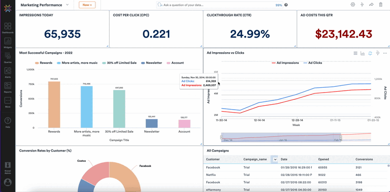
Tableau
Tableau is a data visualization tool known for its aesthetics and simplicity, enabling users to create visually appealing dashboards with minimal effort. It supports a wide range of data sources and uses a drag and drop interface. Tableau was built before data storage systems such as MongoDB were developed, and as a result, best supports structured data.
Pros
- Drag and drop interface
- Chart types are visually appealing
Cons
- Requires MongoDB connector and driver
- Requires relational data

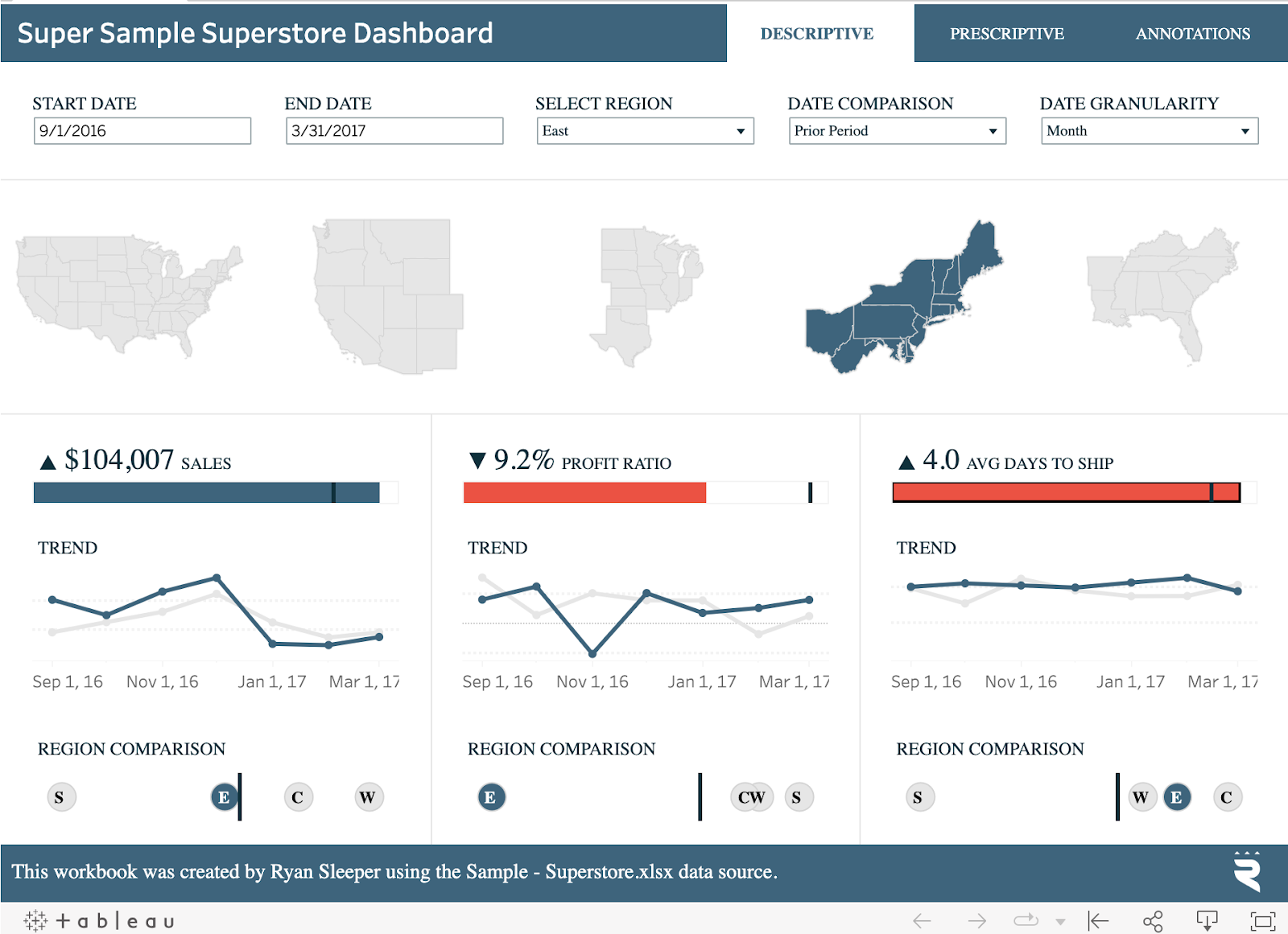
Qlik
Qlik is a data analytics tool known for its intuitive design for data exploration, allowing users to discover insights via a visual builder. It offers both a cloud and an on-premise version. Some features Qlik supports includes reporting, dashboard and visualization building, embedding and more.
Pros
- Good for data exploration
- Generally user friendly
Cons
- Requires MongoDB connector and driver
- Steep learning curve for complex use cases
MongoDB Reporting &Visualization Tools: The Ultimate Comparison
| Tool | Ease of Use | Pricing | MongoDB Integration | Customization | Functionality |
|---|---|---|---|---|---|
| MongoDB Charts | Intuitive drag-and-drop UI; designed for MongoDB users | Free for up to 1GB/month; $1/GB after; hosted on Atlas | Native MongoDB Atlas integration | Basic styling and branding | Basic visualizations; real-time updates; limited advanced analytics |
| Looker | Designed for technical users; requires LookML | Custom pricing; must contact sales; Looker Studio has limited free version | Requires MongoDB BI connector + JDBC driver | Highly customizable; supports embedding and custom visualizations | Strong analytics; custom modeling (LookML); embedding; alerts; no multi-source joins; no built-in ML |
| Knowi | User-friendly drag-and-drop, query editor, and natural language support | Tiered cloud plans + on-prem options; no ETL/ELT tools needed | Native integration (no connectors or drivers); works with Atlas too | Highly customizable widgets and dashboards; supports CSS/JS | Advanced analytics, NLQ, ML, embedded dashboards, alerts, cross-source joins, direct or cached queries |
| Tableau | Easy-to-use UI with drag-and-drop dashboard builder | Starts at $15/user/mo; can be expensive with add-ons | Requires MongoDB BI Connector + driver | Deep customization; supports interactive dashboards and stories | Advanced analytics; predictive modeling; strong visual storytelling; limited NoSQL-native support |
| Qlik | Drag-and-drop with guided data exploration | Varies by deployment type and user licenses | Requires MongoDB connector | Extensive dashboard customization and extension options | Associative analytics, embedded dashboards, NLP queries, anomaly detection, strong for complex data scenarios |
Final Thoughts
| Tool | Pros | Cons |
| Knowi | – Supports MongoDB and MongoDB Atlas natively – Seamlessly supports NoSQL/SQL data blending – Supports MongoDB Query Language natively | – Limited ML capabilities – May require query optimization with direct connections |
| MongoDB Charts | – Already integrated with MongoDB data – Drag and drop builder | – Only supports MongoDB data – Doesn’t easily support cross-collection joins |
| Looker | – Lots of visualization options – Supports git version control | – Requires MongoDB connector and JDBC driver to pull data in – Requires learning LookML |
| Tableau | – Drag and drop interface – Chart types are visually appealing | – Requires MongoDB connector and driver – Requires relational data |
| Qlik | – Good for data exploration – Generally user friendly | – Requires MongoDB connector and driver – Steep learning curve for complex use cases |
Choosing the right MongoDB reporting tool depends on your use case:
- Use MongoDB Charts for simple, MongoDB-native visualizations.
- Choose Knowi for real-time, multi-source analytics with AI, ML, and document support—ideal for teams that want no-ETL, natural language queries, and data unification.
- Go with Qlik if you want a feature-rich platform and don’t mind higher costs or limited extensibility.
- Use Tableau if visual polish and broad connector support (via SQL) is your priority, but be prepared for complex setup.
- Select Looker if you need flexible embedding and are already in the Google Cloud ecosystem—but expect a steep integration curve.
Understanding your organization’s needs, budget, and technical skillset will help you select the most suitable tool to unlock the full potential of your MongoDB data.
If you need native MongoDB connectivity with no SQL translation layer, book a Knowi demo to see how it queries your MongoDB collections directly.
Related Resources
- MongoDB vs SQL: Key Differences
- MongoDB Charts: What It Is and How It Works
- Best Embedded Analytics Tools
Frequently Asked Questions
What is the best tool for MongoDB visualization?
MongoDB Charts is easiest on Atlas for basic dashboards. Knowi is best for native MongoDB queries without a BI Connector, cross-source joins, and embedded analytics. Tableau and Looker work through the BI Connector but add latency and limit flexibility.
Can Tableau connect to MongoDB?
Yes, through the MongoDB BI Connector, which translates queries to SQL. This adds latency and flattens nested documents, which can distort aggregations. Tools with native MongoDB connectors like Knowi avoid this translation layer entirely.
What is MongoDB Charts?
MongoDB Charts is the native visualization tool in MongoDB Atlas. It connects directly to Atlas clusters for basic chart types without aggregation pipelines. Limitations: Atlas-only, no SQL querying, limited embedding, and no cross-source joins.
How does Knowi connect to MongoDB?
Knowi uses the native MongoDB driver, not SQL translation. Add your connection string, write MQL or use the visual builder, and join MongoDB results with SQL, APIs, or other NoSQL sources in a single dataset.
What is the MongoDB BI Connector?
The BI Connector translates MongoDB documents to SQL tables for tools like Tableau. It flattens nested arrays into rows, adds latency, and prevents use of MongoDB-specific operators. Available on Atlas M10+ or as a self-hosted binary.