Want to skip ahead and get a Mongo BI solution launched? Check out our MongoDB Analytics page where you can start a Knowi trial. You can also set up a 15-minute call with a member of our team to see if Knowi may be a good BI solution for your project.
Table of Contents
Introduction
In the first part of our MongoDB series, we provided an overview of MongoDB Atlas, MongoDB’s cloud-based, open-source, NoSQL database offered as a fully managed DBaaS. It’s one thing to find a home for your data, it’s another thing to be able to understand it and put it to use. In this post, we’ll provide an overview of existing visualization tools for performing and visualizing MongoDB analytics, including MongoDB’s own data explorer tools, traditional BI tools, and native solutions like MongoDB Charts and Knowi.
MongoDB’s Data Explorer Tools
First, we’ll discuss MongoDB’s explorer tools MongoDB Data Explorer and MongoDB Compass. While useful, keep in mind that these are merely GUI tools that allow you to visually interact with your data and not meant for more meaningful visualizations.
MongoDB Data Explorer
MongoDB Data Explorer is a powerful feature available only in MongoDB Atlas. It comes with full CRUD functionality and allows you to query, explore, and take action on data residing inside your MongoDB Atlas cluster right from your web browser.
Specifically, Data Explorer in Atlas allows you to:
- View databases, collections, and indexes in your cluster.
- Create and drop databases, collections, and indexes.
- Insert/edit/delete documents.
- Create and run aggregation pipelines to process your data.
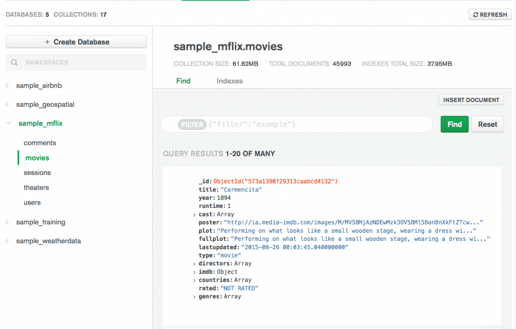
Data Explorer makes it easy to perform actions on your data, allowing for even faster deployment of your Atlas clusters.
MongoDB Compass
MongoDB Compass is a stand-alone application and the go-to GUI tool for MongoDB, much like MySQL Workbench is MySQL’s associated tool. Compass allows you to analyze and understand the contents of the data in your Mongo DB database without formal knowledge of MongoDB query syntax. In addition to exploring data in a visual environment, you can also use Compass to optimize query performance, manage indexes, and implement document validation.
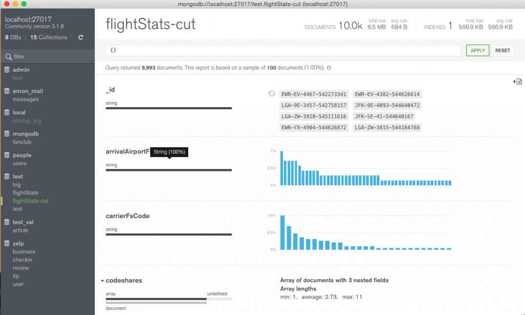
Among its notable features is its built-in schema visualization, which displays the structures of your collections and allows you to quickly visualize and explore your schema to understand the frequency, types and ranges of fields in your data set through an intuitive GUI.
For a look at how MongoDB and MySQL compare, check out our other blog post: MongoDB vs SQL
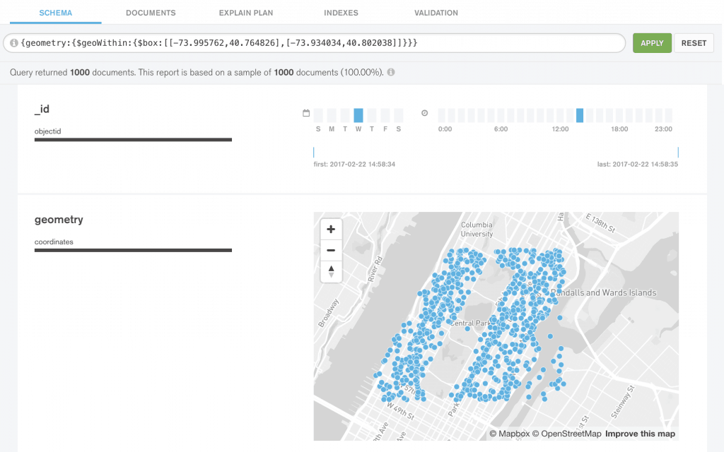
Another feature is its ability to visualize geo-spatial data. In MongoDB, you can store geospatial data as GeoJSON objects or as legacy coordinate pairs. With Compass, you can construct sophisticated queries on this data and execute them with a few clicks and a push of a button, which will then display your results both graphically and as a set of JSON documents.
Visualization Solutions for MongoDB
Popular BI Tools like Tableau and Qlik were introduced in the early 2000’s and 1990’s respectively, and were architecturally built to work with structured (tabular) data from traditional SQL data sources. In contrast, MongoDB came to prominence only in the current decade and at its core is a NoSQL database that stores data in flexible, JSON-like documents. This inherent incompatibility makes visualizing MongoDB data in traditional BI tools challenging, as it requires transforming the data to relational format.
Below, we’ll explore typical approaches to transforming MongoDB data and assess some of the more popular BI visualization tools. We’ll also introduce native solutions for visualizing MongoDB data including MongoDB Charts and Knowi – a BI solution that provides native MongoDB visualization and reporting, allows multi-source joins, with natural language processing (NLP) capabilities.
Transforming MongoDB Data for Use In Standard BI Tools
There are two main options for transforming MongoDB data to relational format in order to visualize them in standard BI tools:
ETL and Data Warehousing
ETL (Extract-Transform-Load) operations on MongoDB data typically goes through the following stages:
- Data Mapping of JSON elements within documents to downstream data structures
- Extracting data from MongoDB collections
- Perform transformations on data (i.e. cleanse, organize data structures), usually done in a temporary staging area
- Load data to a target location, like an operational database or data warehouse
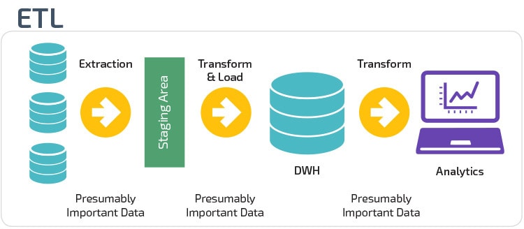
For example, smart data warehouse services like Panoply (Red-Shift based) collect, process, and organize your MongoDB data into standardized columnar tables then stored in their data warehouse. From there, you can connect to a BI tool like Tableau for visualization.
The downside of ETL processes is that moving data takes time, leading to latency and downtime. There are also labor and computing costs to consider, not to mention the planning involved and maintenance concerns. As a result, the data can be stale before any meaningful analytics can be performed.
Use an Open Database Connectivity (ODBC) Data Connector
Another option would be to leverage an ODBC connector like MongoDB’s Business Intelligence (BI) Connector or Simba Technologies’ MongoDB ODBC Driver, in conjunction with third-party BI tools.
For example, the MongoDB BI Connector allows you to use your BI tool of choice to visualize, discover, and report against MongoDB data using standard SQL queries by acting as a layer that translates queries and data between MongoDB and the BI tool.
Specifically, MongoDB’s BI Connector works by:
- Providing your BI platform information about the schema of the MongoDB collection you want to analyze
- Then, receives SQL queries from your BI platform and translates them into appropriate MongoDB queries sent to MongoDB
- Finally, converts the results into tabular format and sends them back to your BI platform for visualization
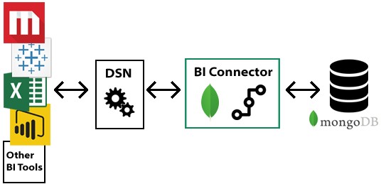
The advantage of using the connector is that it doesn’t store data and purely serves as a read-on-demand bridge between your MongoDB collections and your SQL-based tools, eliminating the need for bulk ETL processing. MongoDB BI Connector was previously only available with a MongoDB Enterprise Advanced subscription and required on-premise installation, but is now available in MongoDB Atlas.
You can also go with a third party vendor like Simba to purchase and install their MongoDB ODBC Driver with SQL Connector. Like MongoDB’s connector, Simba’s SQL connector converts MongoDB data to tabular format through automatic schema generation and normalization of arrays as virtual tables. It also comes with a schema editor you can use for further schema refinement. From there, you can connect to a BI tool like Tableau for visualization.
Industry-Standard BI Tools for Mongo DB Visualization
Now that we’ve explored methods to transform MongoDB data to relational format, let’s assess some of the more popular BI tools used for visualization.
Tableau
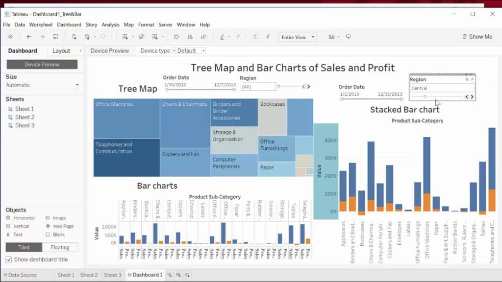
Tableau distinguishes itself with superior ad-hoc visualization capabilities compared to its competitors without requiring technical or programming skills to operate. Tableau is excellent as a single-user desktop solution, though as a full-fledged BI tool, has limitations. Tableau, like all other industry-leading BI solutions, is architecturally built for relational data, requiring MongoDB BI connector or ODBC drivers to convert MongoDB data.
Qlik
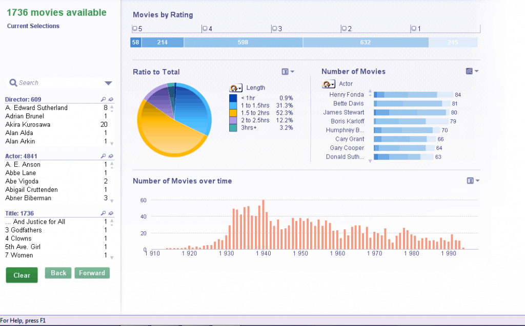
Qlik, similar to Tableau, provides an interactive dashboard experience to its users. It enables business users to freely explore and find connections, patterns and outliers in data without having to model those relationships in advance. Qlik typically requires prerequisite knowledge to get the most out of.
Looker
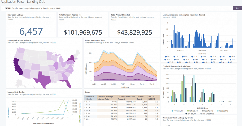
Looker (now acquired by Google) is a browser-based software that like Tableau, makes it easy to choose, customize, and create a variety of interactive visualizations, with a data modeling layer. Looker is also built for SQL-based data sources. Highlights of the Looker platform includes LookML, a data modeling syntax and Blocks, pre-built pieces of code that you can customize for visualization and data modeling, allowing you to use the work others have already done rather than starting from scratch.
Native Solutions for MongoDB Visualizations
While transforming MongoDB data via ETL or using ODBC connectors are viable options to integrate with BI tools for visualization, they are far from seamless. ETL methods can be expensive, complicated, and time-consuming while ODBC options shoehorn MongoDB data into relational form and come with issues inherent in MongoDB to SQL conversions. Native solutions offer a seamless way to interact with MongoDB data in its natural form, instead of shoehorning the data into relational format.
Custom Code
First, let’s briefly discuss another alternative to visualizing MongDB data, which is to write custom code using charting libraries like D3.js or Bokeh. D3 is an open-source JavaScript library used to create custom interactive data visualizations in the web browser using SVG, HTML and CSS.
D3 can be difficult to learn, so many developers opt for Bokeh, a data visualization library that allows you to code in Python and output JavaScript charts and visuals in web browsers. The steps to visualizing MongoDB data with Bokeh typically include:
- Connect Python with MongDB database with Pymongo, a native Python driver that interacts with MongoDB
- Import Bokeh library and other visualization modules into Python
- Send MongoDB data into a pandas dataframe so it is in tabular format
- Perform data/text cleaning in Python as needed
- Write code to create visualizations within Python
- Use Bokeh function to convert visualization to Javascript/HTML that can be embedded in a web browser.
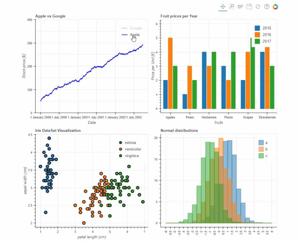
Writing your own code to visualize MongoDB data provides you a high degree of control and customization options, though it requires technical and programming skills that may be a hurdle for non-technical users.
MongoDB Charts
In an effort to remove the technical barriers to data visualization, MongoDB released MongoDB Charts, its own native visualization tool. Because MongoDB Charts natively supports the document model, it eliminates the need to worry about code, tools, data movement or data duplication when creating and sharing data visualizations. MongoDB Charts comes fully integrated with MongoDB Atlas, but can also be installed onto a server for on-premise enterprise users.
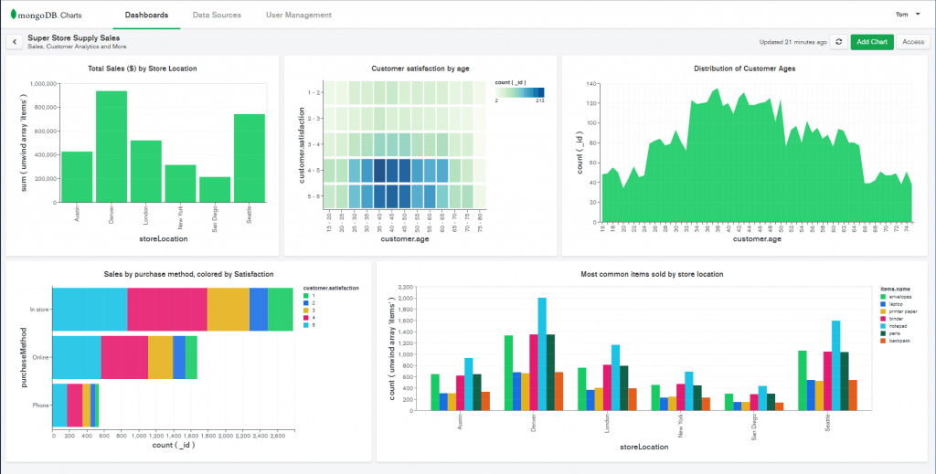
MongoDB Charts comes with a host of features including:
- Ability to build common chart types, including bar, line, scatter, heatmaps, tables and number charts
- Support for the MongoDB document model, including nested documents and arrays
- Arranging charts onto dashboards
- Sharing dashboards with your team
- Embed charts into external web applications
- Visualize geospatial data with new map charts
- Advanced data filtering, eliminating the need to type in queries
- Pre-process data with custom aggregation pipelines
Getting started with Charts within Atlas is quick and easy. In just a few minutes you can select a data collection in your Atlas cluster as your data source, drag and drop fields from the collection into a chart builder (like Tableau), then add multiple charts onto a dashboard. Charts also allows you to unwind nested arrays and have it instantly reflected in the visualization.
If you’re a MongoDB Atlas subscriber, Charts provides a simple solution to visualizing MongoDB data, but note that each chart can only display data from a single collection/data source. Typically, data today is a mix of structured and unstructured variations and stored across disparate data sources. To be a truly data-driven organization, you may need a more advanced BI solution.
Knowi for MongoDB Analytics
Knowi is a BI tool that natively integrates with MongoDB so you can leverage the speed, flexibility, and scalability of MongoDB for analytics without the constraints of moving your data or installing drivers. What differentiates Knowi is that it not only delivers truly native MongoDB visualization and reporting but also allows you to join disparate data sources.
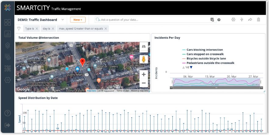
Knowi includes a host of advanced features including:
- Native integration to NoSQL data sources along with SQL databases, REST-API and JSON/CSV
- Drag & Drop Query Generation – giving you the option to either write the queries directly or use an automatic query generator for MongoDB and other sources.
- Optional SQL-like post-processing in cases where further processing is needed after the initial query
- Ability to create joins across multiple data sources (SQL and NoSQL) to process, blend and store combined results seamlessly
- Over 30 visualization options that can be arranged in interactive dashboards
- Embeddable dashboards that can be embedded in data applications, shared with other users, or emailed as PDF reports for enterprise-wide reporting
- Natural language BI capabilities that enable non-technical users to ask questions in English and get answers from the data instantly
- Ability to integrate machine learning algorithms directly into your data analytics workflows and automatically trigger actions based on resulting calculations
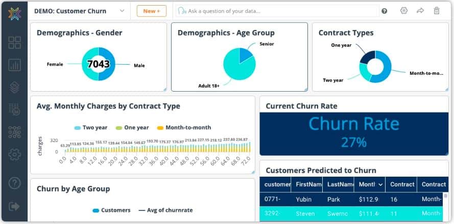
Knowi can instantly transform any data into insights and data-driven actions. In Part 3 of this series, we’ll take an in-depth look at how you can connect your MongoDB data to Knowi, perform advanced analytics and visualization on that data in minutes, and explore how Knowi’s other advanced features can help you get the most out of your data.
Summary
- There are different approaches to visualizing MongoDB data, including MongoDB’s own GUI tools, traditional BI platforms, and native solutions like MongoDB Charts and Knowi
- GUI tools like MongoDB Data Explorer and Compass are data explorer tools that allow you to visually interact with data but not meant for more meaningful visualizations
- Visualizing MongoDB data in traditional BI tools like Tableau and Qlik can be challenging since they were architecturally built to work with structured (tabular) data from traditional SQL data sources while MongoDB is a NoSQL database
- Making MongoDB data work with traditional BI tools often require transforming the data via cumbersome ETL processes or the use of ODBC data connectors that shoehorn the data into relational form
- Writing custom code to visualize MongoDB data provides more control and customization options, but requires programming skills that can be a hurdle to non-technical uses
- Native solutions like MongoDB Charts supports NoSQL data and eliminates the need to worry about code, tools, data movement or data duplication when creating and sharing data visualizations
- Knowi is a BI platform that natively integrates with MongoDB. It provides instant visualization and reporting, allows you to join data across disparate sources, with NLP capabilities for self-service analytics