
Table of Contents
- Introduction
- Connecting to InfluxDB
- Querying Your Datasource
- Analyzing & Visualizing Your Data
- Diving Deeper With Search-Based Analytics
- Summary
Introduction
Wikipedia defines the Internet of Things (IoT) as “a system of interrelated computing devices, mechanical and digital machines provided with unique identifiers and the ability to transfer data over a network without requiring human-to-human or human-to-computer interaction.” To give an example, imagine a home security system and a smartwatch that both automatically send data to your phone.
While the IoT removes the need for human-to-computer interaction over the process of transferring data itself, human-to-computer interaction is still a necessary portion of analyzing IoT data. In order to interact with their IoT data, humans need a database where they can safely store it and a visualization platform where they can efficiently analyze, visualize, and ultimately draw insights from it.
This is where InfluxDB and Knowi come in. InfluxDB is an open-source database that was purpose-built by the team at InfluxData for storing time-series IoT data, and Knowi is an analytics and visualization platform that offers broad native integration to InfluxDB. Knowi’s broad native integration sets it aside from many other analytics platforms which struggle with the unstructured nature of InfluxDB’s data, and ensures that you’ll have no issues using Knowi to query IoT data from InfluxDB in real time. In this tutorial, you’re going to learn how to use Knowi to analyze and visualize data from InfluxDB.
Connecting to InfluxDB
Once you’ve logged into your Knowi account, the first step is to connect to an InfluxDB datasource. In order to do this, follow these steps:
- Maneuver over to the panel on the left side of your screen and select “Data sources.”
- Find and select “InfluxDB” from “NoSQL Datasources.”
- Your datasource, host, and database name are automatically filled out here; all you need to do is save your datasource.
Congratulations on connecting to InfluxDB!
Querying Your Datasource
When you saved your datasource, you should’ve received an alert that said “Datasource added. Configure Queries.” In order to set up your first query, follow these steps:
- Click “Queries.”
- Before you do anything else, name your report “InfluxDB Query” in “Report Name*” and then look directly above your report name. You should see a new alert at the top of your screen that reads “Tables retrieved. Use the Query generator section to discover and build reports/queries.” What this means is that Knowi automatically indexed every table that is stored within the InfluxDB database that you connected to, and you can now select tables from this index.
- Scroll down to “Tables,” click on the down arrow, and select “h2o_temperature.” This will lead Knowi to automatically create an InfluxDB Query that calls all columns from the first 1,000 rows of this water temperature table in your InfluxDB database. This limit of 1,000 is just a default limitation, but Knowi can handle larger loads without any issue, so go ahead and delete the portion of your InfluxDB which says “limit 1000.” This water temperature table contains water temperature measurements conducted every six minutes at two separate locations and recorded in degrees Fahrenheit.
- Move to the bottom left corner of your screen and click “Join.” This will set up a second query builder where you will generate a second query that you will eventually join with your first. In this second query builder, we’re going to repeat a very similar process to the first query. Use the down arrow under “Tables,” select “h2o_quality,” and delete “limit 1000” from the InfluxDB query that Knowi automatically generated. Just like the water temperature table, this water quality table also contains measurements that are conducted every six minutes.
Before we get into step 5, I think it’s good to explain why you need to take this step. Water quality is measured by a metric that is called water quality index and shortened to just “index” in our water quality table. Unlike water temperature, which remains fairly consistent, water quality index is extremely volatile and can range from anywhere between the minimum measurement of 0 and the maximum measurement of 100 within the course of an hour. To give you an idea of how volatile this is, here is what it would look like if we visualized water temperature and water quality index over the course of one day:
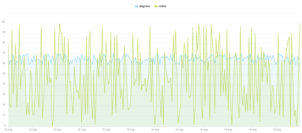
I seriously considered not including this image in this tutorial because it is hideous enough to push viewers away and senseless enough to make viewers question how it could possibly appear in a tutorial on proper data analysis. I ultimately included, though, because I felt the need to show just how volatile water quality index is on the basis of 6 measurements per hour we want to avoid visualizing it in that manner.
The good news here is that unlike water quality over the course of 6 measurements per hour, average water quality index over the course of an entire day is actually rather consistent, and we can absolutely gain valuable insight from analyzing it on that basis. This is where Cloud9QL comes in. Cloud9QL is Knowi’s powerful SQL-style syntax that allows you to apply post-processing on your queries after you’ve set them up, and in this case, Cloud9QL will be used to convert water quality index into daily averages and make your query a bit neater. Now that you know exactly why we need to convert our measurements to average daily water quality index, and how we’re going to do it, you’re ready to move on to step 5:
- Down below the InfluxDB Query that you just set up to query the water quality table, enter the following syntax into Cloud9QL Query:
select *, day_of_month(time) as Day;
select avg(index) as Index, time as Date, location
group by Day, location;- Next, use the eye icon at the top left corner of your query builder to preview the results of this specific query. As you can see, you have daily average water index for each date at two different locations. Now, before we join the water quality table with the water temperature table, we need to apply this same process to the water temperature table. In order to do this, scroll back up to your first query which you set up to query the water temperature table, and enter the following syntax into Cloud9QL Query:
select *, day_of_month(time) as Day;
select avg(degrees) as Temperature, time as Date, location
group by Day, location;- Now, maneuver just a bit down to the join builder in between your two queries. Click “Join Builder.” Set your join type to an inner join, and set location equal to location, and date equal to date. Then select “Save” in order to save your join.
- You’re almost done here, but you’ll need to revert to Cloud9QL one more time to complete our query in the format that we want it. This time, use the “Cloud9QL Post Query” at the bottom of your screen and enter the following syntax:
Select Temperature, Index, Date, location as Location
order by Date, location- Now, click “Preview” at the bottom left corner of your screen. You should see the daily water temperature and water quality index for Santa Monica and Coyote Creek. If you do, that means you’ve done everything correctly, which means it’s time for you to click “Save & Run Now” in order to run your query.
Your query has now been officially completed. Nice work!
Analyzing & Visualizing Your Data
Now that you’ve finished your query, it’s time for you to enjoy the fruits of your labor by utilizing Knowi’s visualization capabilities. Once you saved and ran your query, the results were stored as a dataset within Knowi’s elastic data warehouse. Additionally, the data grid referenced that you looked at before saving your query is now stored as a widget. In order to visualize your widget and create more visualizations, follow these steps:
- Move to the top of the panel on the left side of your screen and select “Dashboards.” Then, select the plus icon, name your new dashboard “InfluxDB Dashboard” and click “OK.”
- This dashboard will serve as home for your widget and every other widget that you create. Head back to the panel on the left side of your screen, and select “Widgets” this time. Drag the new “InfluxDB Query” widget that you created over to your Dashboard.
- Hover over to the top right corner of your new widget in order to reveal the ellipses icon. Select it, then scroll down and select “Analyze.” Drag the “Location” bar over from the top left corner of your new screen to “Filters.” Under value, type “coyote_creek” with the underscore included and click “OK.”
- At the top of your screen, select “Visualization.” This will show you your data grid, which isn’t too different from the data that you were analyzing. To change this, click on “Data Grid” under “Visualization Type” in the top left corner of your screen and change your visualization to an “Area” visualization. If you’ve done this right, you should see an area chart which conveys that average water temperature remains remarkably consistent while water quality has a decent amount of day-to-day variance.
- Head to the top right corner of your screen and select the “Clone” icon – it looks like two pieces of paper stacked atop one another. Name this new widget “Coyote Creek Daily” and select “Clone.” Then select “Add to Dashboard.”
Diving Deeper with Search-Based Analytics
While clicking and dragging metrics over to the filter area and manually setting filters isn’t too hard, sometimes you just want to ask questions in plain English and receive results in real-time. That is where Knowi’s Search-Based Analytics feature, built on Natural Language Processing, comes in. Let’s say you wanted to visualize only data from the other location – Santa Monica – and instead of viewing daily averages which are still prone to some fluctuation, you wanted to view weekly averages. Here’s how to do this:
- Head back to the top right corner of your first widget, select the ellipses icon, and select “Analyze.” Type “show me temperature, index, and date by week for santa monica” and enter it. This will automatically calculate the weekly average for water temperature and water quality index.
- Head over to “Visualization” at the top of your screen and change “Visualization Type” to “Area.”
- Select the “Clone” icon and name this new widget “Santa Monica Weekly” and select “Clone.” Then select “Add to Dashboard.”
Summary
To review, you began this tutorial by connecting to an InfluxDB database. Then, you set up a query which pulled daily averages of water temperature and water quality index from two separate tables and used Knowi’s join builders to join them; the results of this query were stored as a dataset within Knowi’s elastic data warehouse. You followed this up by building a dashboard to visualize the raw data that was obtained as a result of your query, and created an area visualization that conveyed some of the results in a manner that was much easier on the eyes. Last, you used search-based analytics to analyze a different portion of your data in a different manner.