Table of Contents
- Introduction
- Setting Up a REST API as Your Datasource
- Querying Data From Your REST API
- Joining Data From Your REST API With Data From Another REST API
- Scheduling Automatic API Calls
- Visualizing Your Data
- Using Search-Based Analytics to Query Your Data
- Summary
Introduction
Pulling data from REST APIs is a very common practice in today’s world of analytics, and for good reason. APIs are powerful tools that allow the user’s server to make a call to another server and directly pull large sets of data without ever leaving the user’s website or program. Users can also set up automated API calls, which allow them to pull data from a foreign server over a specified set of time intervals.
While most data from REST APIs comes in JSON format, some data comes in CSV, SQL, or NoSQL format as well. Knowi has broad native integration to not only JSON, but also to CSV, SQL, and NoSQL data, which makes Knowi uniquely equipped to efficiently make API calls and eliminate tedious ETL processes.
Setting Up a REST API as Your Datasource
Once you’ve logged in to your Knowi trial account, the first step is to connect to your target REST API and ensure you’ve got a connection. Here’s how to do this:
- Use the panel on the left side of your screen to click on “Data sources.”
- Scroll all the way to the bottom, and in the middle “External” section, click on {REST}.
- Make sure to name your new datasource. For the purpose of this tutorial, let’s call this “Coronavirus Datasource.”
- Enter the URL for your API REST host in the top right corner. For this tutorial, we’re going to use a Github repository that includes various files that come directly from Johns Hopkins University. Use this link for your REST host:
https://raw.githubusercontent.com/CSSEGISandData/COVID-19/master/csse_covid_19_data/csse_covid_19_time_series- Scroll down to the bottom and find the blue button titled “Test Connection.” Click on this, and once you do, you should receive an alert at the top of your page that says “Connection Successful.”
- Once you’ve ensured that you have a connection, move over to the right of the “Test Connection” button and click “Save.”
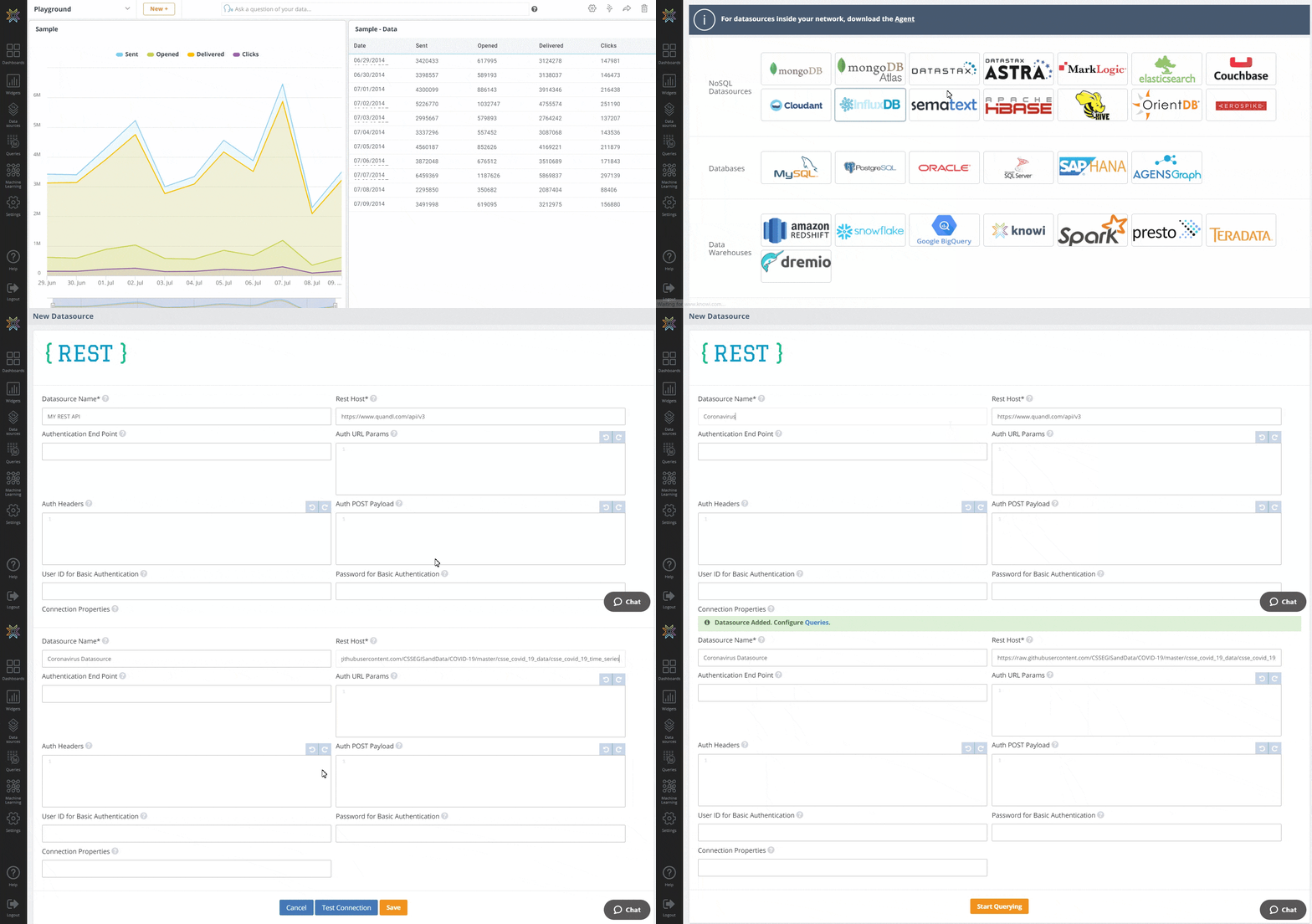
Congratulations! You’ve set up your first datasource.
Querying Data From Your REST API
Now that you’ve finished setting up your first datasource, it’s time to start making queries on your data. Here’s how you do this:
- When you finished saving your datasource, you should’ve received an alert at the top of your page saying “Datasource Added. Configure Queries.” Click on the word queries. (Alternatively, you can go back to the panel on the left side of your screen and click on “Queries” which is right below Data sources, and then select “New Query +” from the top right.)
- Before you start doing anything else, make sure to name your query under Report Name*, and to select your datasource if you didn’t go directly to the query after you saved your datasource. Let’s call this report “API Call.”
- Scroll down to the settings and add the end point for your API Call and under “End Point.” The end point that we’re going to use here returns a large CSV file with daily confirmed COVID-19 cases from every county in the United States. Use this end point:
/time_series_covid19_confirmed_US.csv- Find the blue “Preview” button at the bottom left corner of your screen and click on the little up arrow on the right. Scroll up to 100 and click on that to quickly preview 100 rows of your data.
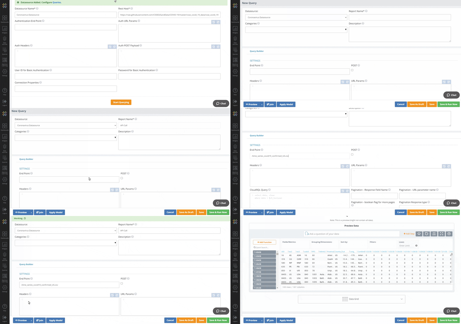
- Our data set has an individual column for each date, which isn’t what we want. This means it’s time for us to use Cloud9QL – Knowi’s powerful built in query language – to query our data and present it in the form that we want. Scroll up to “Cloud9QL Query” to start using it.
- Let’s say that our end goal is a table with two columns: date, and new confirmed COVID-19 cases in the United States on that day. Cloud9QL will allow us to do this in just four easy steps:
- Reverse transpose all columns and add a new column titled “Date” to store the new dates that were just reverse transposed.
- Select one new column that uses Cloud9QL’s str_to_date function to convert the date from a string to a date, and one new column that is the sum of cases.
- Group our data by date.
- Select date and one new column that uses Knowi’s delta function to subtract the total number of cases on the prior date from the total number of cases on the current date. In order to enact these steps, just copy and paste the following syntax into your Cloud9QL Query:
select reverse_transpose(UID,iso2,iso3,code3,FIPS,Admin2,Province_State,Country_Region,Lat,Long_,Combined_key,Population,Date,Cases,*);
select str_to_date(date,MM/dd/yy) as Date, sum(Cases) as Cases
group by date;
select Date, delta(Cases) as Cases- Once you’ve pasted that syntax into your Cloud9QL Query, head back to the blue “Preview” button and preview the first 100 rows again to make sure the data is in the format that we want it. You should see a two-column table with the date and the number of new COVID-19 cases on that date.
- Once you’ve confirmed the data is in the format that you want, select the bar that currently says “Data Grid” just below your preview and change the visualization type to “Line Chart” in order to see a more compelling view of the 100 rows that you just previewed.
- We’ll get back to visualizing the rest of our data later. For now, click the green “Save & Run Now” button to save your query.
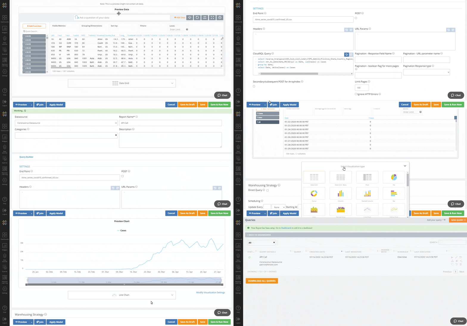
After you’ve saved your query and ran it at least once, Knowi used the query results to create a virtual dataset and stored that dataset within its elastic data warehouse. Knowi will do this every time you run this query.
Joining Data From Your REST API With Data From Another REST API
Now that you’ve set up one REST API as a datasource and queried it, doing the same thing with another should be easier. To start, we’re going to repeat the process that we used to set up our first REST API:
- Use the panel on the left side of your screen to click on “Data sources.”
- Click on the orange button in the top right corner of your screen titled “New Datasource +.”
- Scroll all the way to the bottom, and in the middle “External” section, click on {REST}.
- Make sure to name your new datasource. We’ll call this one “Stock Market Datasource.”
- Enter the URL for your API REST host in the top right corner. We’re going to use Alpha Vantage’s API that provides us with real-time stock market data. Use this URL:
https://www.alphavantage.co- Scroll down to the bottom and find the blue “Test Connection” button. Click on this, and once you do, you should receive an alert at the top of your page that says “Connection Successful.”
- Once you’ve ensured that you have a connection, move over to the right of the “Test Connection” button and click “Save.”
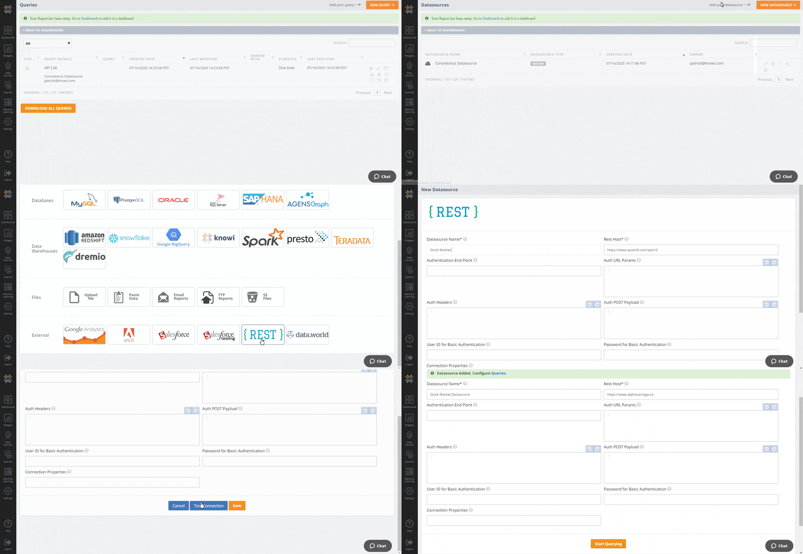
Now we’ve got two datasources set up: Coronavirus Datasource and Stock Market Datasource. It’s time to join our stock market data with our Coronavirus data. Here’s how we do this:
- Go back to the panel on the left hand side of our screen and go back to “Queries.”
- Instead of creating a new query, we’re going to append our current query with a query of another datasource and join data from the new query with the data that we already have. Start this process by clicking on the pencil icon at the right of our existing query in order to edit it.
- Once you’ve opened your query, scroll to the bottom and click on the blue “Join” button.
- You’ll notice that a new query builder has appeared. Select the new Stock Market Datasource that you just created as the datasource for this portion of your query.
- Scroll down to the settings within the query builder and set your end point. We’re going to use /query, which lets the API know that we’ll be querying its data. Copy and paste this and set it as your end point:
/query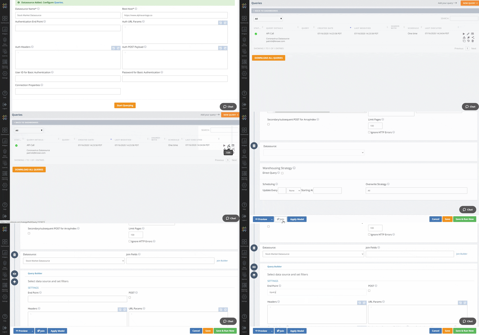
- In this case, Alpha Vantage requires the function that we want our query to run, the symbol that we want to run our query on, an API key, and the data type that we want our query to return. This means we need to set our URL Params before we make our API call. We want our query to return daily time series data from NASDAQ (NDAQ) in CSV format. In order to get this, copy and paste the following syntax into your URL Params:
function=Time_Series_Daily
&symbol=NDAQ
&apikey=YYTO4FCR5F6DCNE1
&datatype=csv- Click on the eye icon to the left of your query builder to preview only this portion of your query. As you can see, we’ve got our data listed as “timestamp,” alongside NASDAQ’s open, high, low, and close prices, as well as the trading volume on that day.
- Scroll back up to where you selected your second datasource and find “Join Builder” to the right of your datasource. Click on the Join Builder to get the join process started; it may take some time for Knowi to retrieve the fields from each data set.
- In the mean time, set your Join Type to “Inner Join.” Once Knowi has retrieved the fields, set “Date” equal to “Timestamp.”
- For the sake of this exercise, we just want three columns: the date, the number of COVID-19 cases on that date, and NASDAQ’s close price on that date. In order to trim our query down, we’ll use Knowi’s Cloud9QL Post Query feature, which allows the user to make additional queries to their data after everything has been extracted and joined. Enter the following code into your Cloud9QL Post Query:
select Date, Cases, close as Close- Click on the preview button again in order to make sure that you’ve got the data in the format that you want it. You should see three columns: Date, COVID-19 cases on that date, and NASDAQ’s Close Price on that date.
- Scroll back to the bottom right corner of your screen and click “Save & Run Now.”
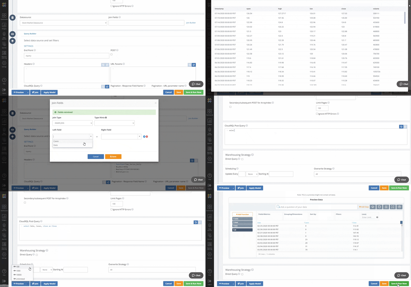
You just completed a query that calls two different APIs, pulls different data from each of them, and returns it all in one table. Nice job!
Scheduling Automatic API Calls
Before we get into visualizing our data, it’s important to think about what we’re trying to visualize. Our end goal is a dashboard that allows us to compare trends between the NASDAQ stock exchange and COVID-19 cases and monitor new trends as they arise. We could set up a dashboard right now that would allow us to visualize what has already happened as of today, but that dashboard would be limited because the latest data would always be from the last time that we manually made the query.
Because we want to monitor things in real time, we want to set up our query so that it automatically pulls new data and allows us to monitor the latest data every time we open our dashboard. Knowi makes it easy to automate this process in just three steps.
- Click on the pencil icon on the right side of your query to return to the query that you just created. Scroll down to the bottom and find “Scheduling.”
- Configure the scheduling process based on how frequently you want to make this API call. Since close price is only updated once per day, set your query to update daily starting tomorrow.
- Don’t forget to click the green “Save & Run Now” button.
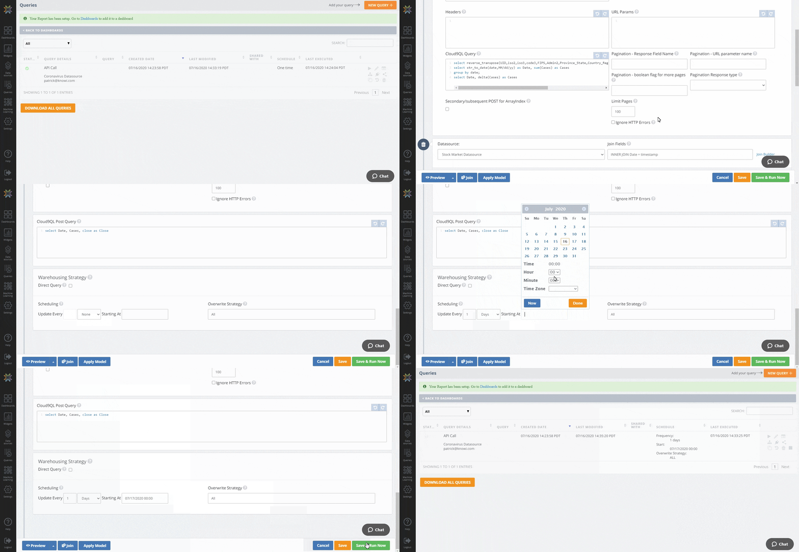
Your query is now set to automatically pull data from two separate APIs every day and automatically join the data from each of them. The last step is to create a visualization for your data to see how things move in real time.
Visualizing Your Data
Even if you weren’t previously curious how NASDAQ’s stock price has moved as COVID-19 has grown in the United States, this tutorial has probably piqued your curiosity. Knowi makes it simple to create visualizations from our dataset so that we can quickly make note of any critical trends. Here’s how we do this:
- Head to the top of the left panel and click on “Dashboards.” Click the small orange “+” button and name your dashboard. We’ll call this one “Joint API Call Visualizations.”
- Head back to the left panel and just under dashboards, select “Widgets.” In widgets, you should see the new widget that you created. Click on it and drag it over to your dashboard.
- Click on the 3 dots in the top right corner of the widget, and then select “Settings.”
- Click on “options” to open up your options menu, scroll down to “Secondary Y-Axis” on the left side of your options menu, and select “Close.” This will create a secondary Y-Axis for NASDAQ’s stock price that allows you to see how it has trended.
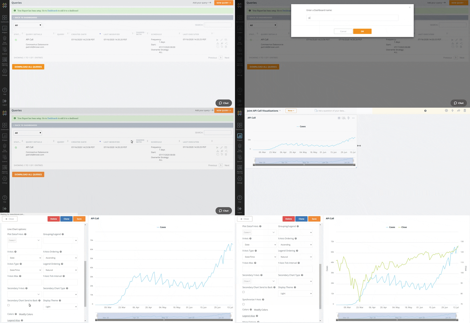
- Use Knowi’s visualization settings to make your chart look more professional. Use “Modify Colors” to change New Cases to #CE0000 and close to #CECECE, change your Legend Alias to something that describes the data in more detail, and add a title for your primary X and Y axes.
- In the top right corner of the screen, click on the orange “Save” button.
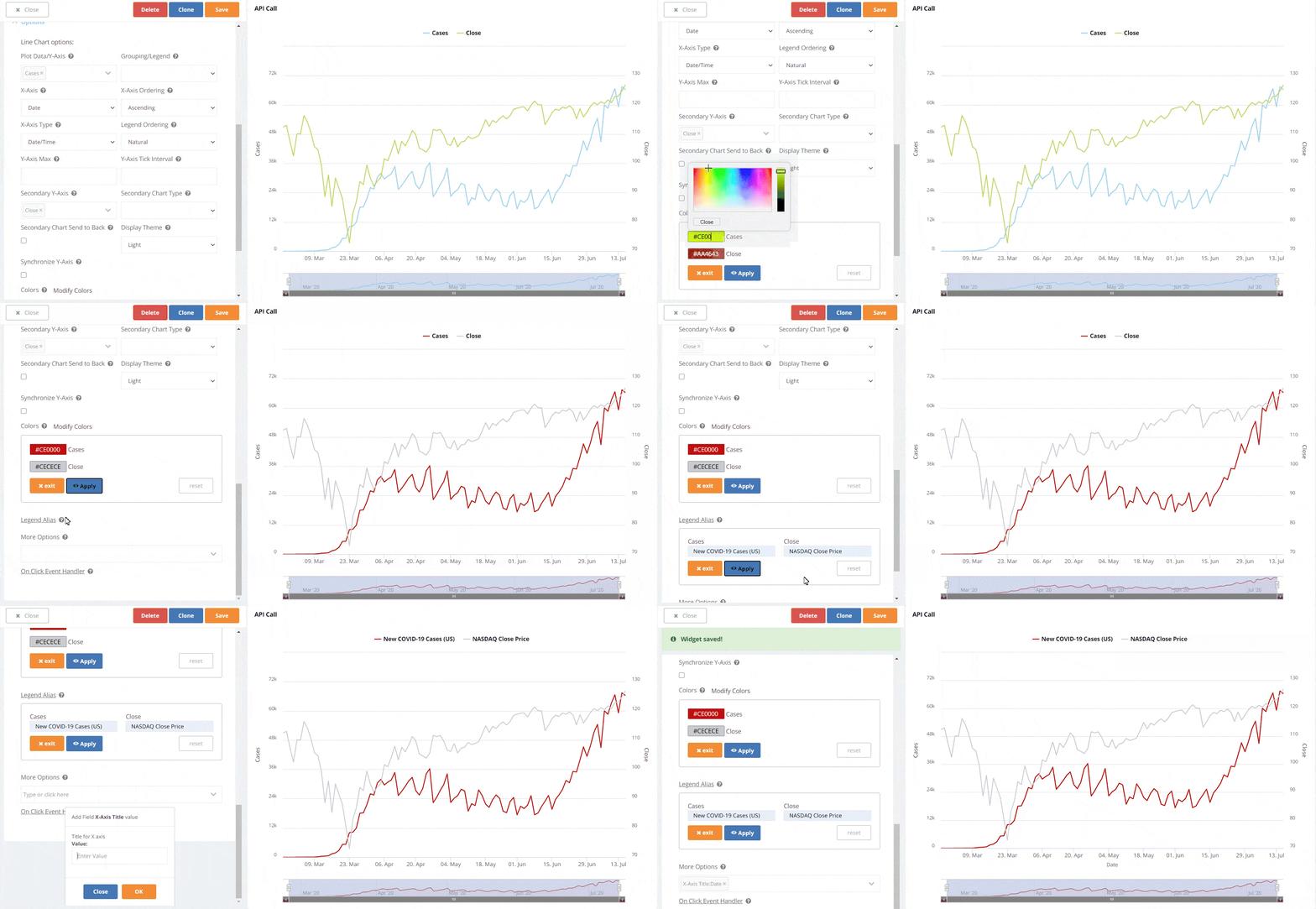
Once you close your widget, you’ll see that you’ve now got a dashboard set up to visually monitor and compare trends in the movement of COVID-19 cases in the United States and the NASDAQ stock exchange.
Because you’ve scheduled your query to automate daily API calls, you’ll be able to use your dashboard to monitor these two variables as time passes.
Using Search-Based Analytics to Query Your Data
Now that you’ve got your dashboard set up, you’re ready to use Knowi’s natural language processing abilities to query your data using search-based analytics. You’re also ready to share your dashboard with somebody else and let them use search-based analytics to query your data – even if they’re not familiar with Knowi. Here’s how to run search-based analytics on your data:
- Head to the top right corner of your widget and click on the 3 dots, then scroll down a bit and click on the “analyze” button. This will show you your data in table format.
- From here, use the search bar above your data to ask your data questions and receive quick answers. Let’s say that we want to see weekly averages of each number in order to eliminate some noise from the daily numbers. All we need to do in order to see weekly averages is type “show me average cases, average close by week” into our search bar in order to quickly transform our data into the format that we want it.
- Now it’s time to visualize our data in this new format. Switch over to “Visualization” and change your visualization to a Line Chart. Make sure to set “Average Close” as your secondary y-axis so that you can clearly see the movement in that variable as well.
- Head over to the top right and click on the “clone” icon. This will create a new widget with the edits that we’ve made to our original widget.
- Once you’re done with your clone, click on the orange “Add to Dashboard” button.
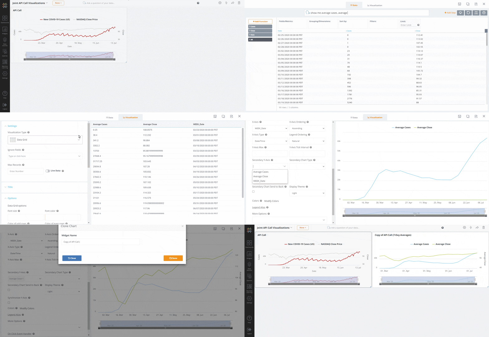
As you can see, this process doesn’t require much more than curiosity and a basic knowledge of the English language. The ability to ask data questions in plain English and return answers can help bridge the gap between data scientists and management, and make Knowi’s dashboards accessible to anybody who speaks English and wants to know more about data.
Summary
To summarize, we just set up two separate REST APIs as datasources within Knowi, wrote a query that calls each of these REST APIs and returns data in a digestible format, and then scheduled that query to make API calls and return new data every day. We then created a new widget from the dataset that was created when we ran our query, as well as a new dashboard, and stored our new widget within our dashboard. We also used search-based analytics to create a separate, smoother visualization that shows us weekly averages of our two variables. Now, all that we have to do in order to monitor NASDAQ’s stock price alongside new COVID-19 cases in the United States is log into our Knowi account.